

Our Blog

 
Our Blog

Our Blog (53)

We've been behind the camera in Bangalore since 2009 — long enough to know a good photograph is rarely just about the camera. This is where we write about the decisions that shape one before it's ever taken: what to wear, how to price a shoot, why AI still can't replace a real photographer, how to hold a toddler's attention for ten unscripted minutes.

We also write about things that have nothing to do with photography at all — because a studio that reads widely tends to see better than one that doesn't.

Some of this will make you a sharper client, or a sharper photographer. Some of it is just a good read. Either way — settle in.

Sub Topics

Business & Personal Branding

Business & Personal Branding (27)

Pricing, positioning, and the decisions that shape how you're seen — on paper and in person.

View items...
Behind the Craft

Behind the Craft (17)

How a photograph actually gets made — technique, gear, and the thinking behind the frame.

View items...
Career Guides

Career Guides (5)

Practical, no-nonsense guides for models and photographers building a career.

View items...
From the Studio

From the Studio (4)

Off-duty reading — what we're into when we're not behind a camera.

View items...

"Say cheese" has produced more bad photographs than any camera ever has. It gives you a mouth shape — teeth bared, cheeks lifted — without the one thing that makes a smile a smile: something behind it.

Everyone knows the result. The photo where you're technically smiling and somehow it still isn't you. Eyes flat, jaw a little clenched, an expression you'd never make in real life because in real life, expressions aren't made — they happen.

This post is about how genuine smiles — the relaxed, teeth-showing, eyes-alive kind — actually get made in photographs. Not with tricks or filters, but with a two-step method any good portrait photographer should be running: one step for the body, one for the face. And a hundred-year-old economics principle explains why the method works so well.

First, Some Honesty: Smiling on Command Is a Trained Skill You Don't Have

Actors, models, and seasoned public figures can take a brief — "give me warm but confident, like you've just heard good news" — and produce that exact expression, on cue, take after take. It looks effortless. It isn't. It's a professional skill built over years of practice, the performing equivalent of a musician sight-reading a score.

Everyday people don't have that skill, and here's the part that matters: you were never supposed to. Expecting yourself to manufacture a genuine expression on demand is like expecting yourself to sight-read Chopin because you once heard a pianist do it. When your photos look stiff, it's not because something is wrong with your face. It's because you were handed a professional's task with no professional's training — usually with the words "okay, big smile!"

There's real mechanics behind why faking it fails. A genuine smile — what researchers call a Duchenne smile, after the French physiologist who first mapped it — involves two muscle groups: the one that pulls the mouth (which you control easily) and the ring of muscle around the eyes (which, for most people, only fires with real emotion). A posed smile moves the mouth and leaves the eyes untouched. Viewers can't name what's missing, but they detect it instantly — we are all, every one of us, lifelong experts at reading faces.

So if the smile can't be commanded, how does a photographer get one from an ordinary person in an ordinary session? By not asking for it at all. Which brings us to the principle that organises everything that follows.

The 80/20 of a Portrait: A Quick Detour Through Pareto

In 1896, the Italian economist Vilfredo Pareto noticed something odd about land ownership in Italy: roughly 80% of the land belonged to about 20% of the population. Decades later, quality-management pioneer Joseph Juran spotted the same lopsided pattern everywhere he looked — 80% of defects traced back to 20% of causes — and named it the Pareto principle: in most systems, a vital few inputs produce the vast majority of the results.

The numbers aren't the point; nobody audits whether it's exactly 80 and 20. The point is the shape of the idea: don't spread your effort evenly across everything — find the vital few things that move the outcome, and pour your effort there.

A portrait is a perfect Pareto system, and it splits cleanly in two:

  • The pose — where a handful of physical instructions produce most of what reads as "good body language," and endless micro-fiddling adds almost nothing more.
  • The expression — where one well-chosen prompt produces more genuine warmth than fifty repetitions of "relax! smile naturally!"

Two systems, two vital-few levers. A master photographer knows exactly what those levers are, and — just as important — knows the order to pull them in. Let's take each.

Step One: The Pose Is Biomechanics, Not Vibes

Here's a truth about being photographed that nobody tells you: you cannot see yourself, so you cannot pose yourself. What feels natural to your body usually photographs as slumped; what photographs as confident often feels slightly odd from inside. This is why "just act natural!" is useless direction — it outsources the job to the one person in the room with no view of the frame.

Good posing is therefore not a talent the subject brings; it's an instruction set the photographer delivers. And the vital few instructions — the 20% that produce 80% of good body language — are pure mechanics:

  • "Shift your weight onto your back foot." Weight evenly planted on both feet photographs as a police lineup. Weight shifted back drops one hip, angles the shoulders, and puts a relaxed curve through the whole body — one instruction, half the pose.
  • "Angle your body slightly away, then bring your face back to me." Squared-on shoulders read as confrontation and width; a slight angle reads as ease and dimension. The face returning to camera keeps the connection.
  • "Grow an inch taller through the top of your head — now bring your chin toward me and slightly down." The lengthened spine fixes the slump; the chin coming forward and down (it feels absurd, like a turtle) defines the jawline and eliminates the double-chin shadow that makes people hate their photos. Feels wrong, photographs right — a perfect example of why instruction beats instinct.
  • "Give your hands a job." Hands with nothing to do broadcast awkwardness — so a pocket, a folded arm, an adjusted cuff, a held lapel. Any job beats no job.
  • "Let a little daylight show between your arms and your body." Arms clamped to the torso merge into it and add visual bulk; a small gap separates the shapes and slims the whole silhouette.

Notice what these instructions have in common: every one of them is physical and followable. Not "look confident" (a feeling you can't aim at) but "weight on the back foot" (an action you can perform right now, first try). This is the instructing skill the photographer must excel at — translating what the frame needs into commands a body can execute. Five cues, sixty seconds, and the subject's body language is 80% of the way there. Chasing the last 20% with endless micro-adjustments mostly produces one thing: a subject who's now been fiddled with for five minutes and is stiffer than when you started.

Which is exactly why a master stops there. Because the pose was never the destination — it was the setup for the part that matters more.

Step Two: The Expression Is Psychology — You Prompt It, You Don't Pose It

Here is the single biggest divider between photographers: what they do once the body is set.

The inexperienced move is to direct the face like it's another limb: "Okay, now smile! Bigger! Natural! Relax your eyes!" Every one of those commands makes the subject more self-conscious about the exact muscles they can't consciously control — the guaranteed route to the flat-eyed, clenched result we started with.

The master's move is completely different: stop directing the face and start directing the thoughts. Expression follows attention. Put the mind somewhere warm, and the face follows automatically — eyes and all, because now the emotion is real and the eye muscles fire on their own.

In practice, this is conversation — but designed conversation. Questions aimed at the tiny topics people actually live for:

  • "What's the one dish you could eat every single day?"
  • "What did your daughter say when she saw you dressed up this morning?"
  • "You mentioned you trek — which one's next?"
  • "Dog person or cat person? …I knew it. What's the dog's name?"
  • "What's the first thing you're doing when this shoot wraps?"

None of these is profound. That's the design. Big questions ("tell me about yourself") make people compose an answer — composing is work, and work shows on a face. Tiny questions about food, kids, pets, hobbies, weekend plans bypass composition entirely and go straight to feeling. The person lights up talking about their dog's ridiculous habit, and that — the flicker of real amusement, the genuine mid-laugh moment, the settling warmth just after — is when the shutter goes. The subject thinks the photographer is just chatty. The photographer is running the most reliable expression-generation system that exists.

This is the same principle we use with our youngest subjects — in the kids' sessions, play is the prompt — and with adults who dread cameras, where the conversation is what dissolves the nerves. Ages change, the wiring doesn't: nobody can perform a feeling on command, and everybody displays one when it's genuinely present.

The sequencing matters enormously, and it's where the two steps lock together: mechanics first, prompts second, never both at once. A subject can't hold five body cues and a conversation simultaneously — so the master sets the body (which holds its position on its own), then moves the subject's attention entirely to the chat. The pose persists in the background; the expression arrives in the foreground; the frame gets both. Run it in the wrong order — or mix them — and each step undoes the other.

Where the Freelancer and the Master Actually Separate

Everything above can be learned from a blog post — this one, even. So why does the gap between an average shoot and a masterful one stay so visible? Because knowing the system and running it under pressure are different skills. The separation shows in four places:

  • Economy of instruction. The freelancer gives fifteen corrections and hopes; the master gives four cues that matter and stops. Every unnecessary instruction costs subject-confidence, and confidence is the raw material of expression.
  • Reading the subject. Prompts aren't one-size-fits-all. The master reads within thirty seconds whether this person opens up over food, family, or football — and adjusts. The wrong prompt category gets polite answers; the right one gets the real face.
  • Recovery. Every session has the moment a subject goes stiff. The freelancer pushes through it ("you're doing great!") and collects fifty identical rigid frames. The master resets — a new stance, a fresh topic, sometimes a deliberate break — because they know a stiff subject produces nothing worth keeping.
  • Invisible speed. The whole two-step, run well, takes three to five minutes per person and never feels rushed. That's not haste; it's the absence of wasted moves.

The Real Test: When It's Not One Portrait, But a Hundred

Here's where the system stops being craft philosophy and becomes hard economics: the corporate headshot day.

Photographing one person well, with unlimited time, is forgiving — even luck will eventually hand you a good frame. Photographing forty, eighty, a hundred and fifty employees in a working day is a different sport entirely. The math is brutal: at scale, you get a handful of minutes per person, most of them arriving mid-workday, camera-wary, between meetings, some openly reluctant. There is no time for luck. There is only system.

And this is precisely where the Pareto two-step proves itself. The master runs it as a repeatable sequence — same vital-few body cues delivered in the same order, a well-stocked rotation of prompts, light already built and locked — and person after person walks into the frame stiff and walks out three minutes later having genuinely laughed once. Multiply across the whole floor: every single employee gets an individually good portrait — real expression, sound body language — and the set is consistent, which is what makes a company's team page look like one organisation instead of eighty separate photo experiences.

Watch a volume shoot run by someone without the system and you see the opposite: the day runs late, the introverts get the worst photos (they needed the prompting most and got the least), and the results zigzag between decent and unusable. Same camera, same light, same employees. The difference was never the equipment — it was whether the photographer had the vital few down to reflex.

It's exactly this that our corporate headshot sessions are built around — the system, run at scale, so the hundredth person of the day gets the same three good minutes as the first.

What You Can Do From Your Side of the Camera

If you're the one being photographed, the good news is your job is short:

  • Don't rehearse a smile in the mirror. You'll be practising the mouth-only version, and it'll be the first thing to surface under pressure.
  • Follow physical instructions even when they feel strange. The chin-forward cue feels ridiculous; it photographs beautifully. Trust the person who can see the frame.
  • Arrive knowing your own tiny topics. The dish, the dog, the trek, the kid's latest phrase. If a photographer asks about them — engage honestly. And if a photographer never asks you anything and just says "smile"… now you know exactly what that predicts about your photos.

That last point doubles as advice for choosing a photographer, by the way. In a trial conversation, notice whether they talk about putting people at ease, or only about equipment. The gear takes the photo; the conversation makes it worth taking.

The Short Version

A genuine smile was never a skill of the face — it's a byproduct of a thought. Since you can't perform the thought on command, a good portrait comes from a two-step handoff: the photographer instructs the body (a vital few mechanical cues do most of that work) and then prompts the mind (one warm little topic does most of that work). Pareto in both steps: the vital few, done precisely, over everything done vaguely.

So the next time a camera points at you, remember — the smile isn't your job. Your job is the thought. Finding it, gently and on schedule, is ours.

Ask a founder how their marketing is going, and you'll usually hear about likes, reach, and follower counts. Ask them how long a visitor stays on their website — and you'll usually get silence.

That silence is expensive. Because somewhere between chasing the feed and neglecting the website, most businesses have the equation backwards: the metric they obsess over rewards being loud for a second, while the metric they ignore rewards being worth someone's time — and it's the second one that search engines, credibility, and eventually sales are built on.

This post makes a case that sounds strange at first and obvious by the end: professional photography is one of the most underrated SEO investments a business can make. Not because Google counts megapixels — it doesn't — but because of a chain of very real, now well-documented mechanisms that runs from the quality of what's on your pages, through how long people stay on them, to where you rank. We'll walk the whole chain, with the evidence.

The Firecracker and the Lamp

First, the mindset problem — because it explains why so many businesses invest in exactly the wrong kind of visuals.

A social media feed is a noisy street. To win there, you have to be the loudest thing on the street for one second — the firecracker. Bright, sudden, impossible to ignore, and completely gone a moment later. Firecracker content genuinely works on feeds: bold text, jarring colours, shock hooks. It collects likes. The platform's algorithm is literally built to reward it.

Your website is not a street. It's a room. And nobody has ever stayed in a room because a firecracker went off in it. People stay in a room because the light is good, the space feels considered, and there's something worth looking at. That's the lamp — quiet, warm, doing its work without applause. Nobody "likes" a lamp. But people arrange their whole evening around the room where the lamp is.

Here's the trap: a like is a reaction, and reactions are cheap — a thumb-twitch on the way to the next post. What builds a business is not reaction but satisfaction — the quiet, pleasant experience of encountering something genuinely well-made. Satisfaction is what makes someone stay, return, remember your name, and eventually buy. And satisfaction is precisely what firecracker tactics cannot produce, because their whole design is to interrupt, not to reward attention.

So the strategy splits cleanly in two. On rented land — the feeds — play the feed's game if you must. But on land you own — your website — the game is entirely different: you're not trying to stop a scroll. You're trying to earn a stay. And everything below is about why earning that stay is now, verifiably, an SEO strategy.

The Old Painting Test

Before the mechanics, a question worth sitting with: why do people stop in front of old paintings?

Walk through any home that has a decades-old family portrait on the wall — a grandfather's formal photograph, a hand-tinted wedding portrait — and watch what visitors do. They stop. Not because the image is loud; it's usually the quietest thing in the house. They stop because a well-made portrait produces a specific feeling: recognition. "That is exactly who he was." The care in the making — the light, the composure, the intention — signals that the subject mattered enough to be recorded properly. And that signal survives fifty years without losing a volt.

Brand photography works on the same wiring. When a visitor lands on a website whose images are original, considered, and true to the business, something clicks that they rarely articulate: "Yes — this is how I would have done it." The photography becomes a proxy for everything they can't yet verify: your standards, your taste, your attention to detail. A visitor who feels that recognition doesn't need convincing; they've already recognised themselves in your choices.

Generic stock photography produces the opposite reaction, and eye-tracking research has documented it for years: users' eyes skip straight past decorative stock imagery — the handshake photo, the smiling call-centre model — treating it as visual noise, while photos of real people connected to the actual business get examined closely. Visitors aren't fooled by filler, and worse, filler tells them something: this business didn't think its own presence was worth photographing properly. That's a statement about standards, made involuntarily, on every page.

Now the Mechanics: How This Actually Reaches Your Rankings

Everything above could sound like brand romance. It stops being romance the moment you look at what came out of the United States v. Google antitrust trial — because Google, under oath, described exactly how the "earn a stay" logic feeds its rankings.

1. Google measures whether people stay — and it said so in court

For nearly two decades, SEOs debated whether Google uses visitor behaviour — clicks, time on page, bouncing back to results — as a ranking input, while Google's public statements stayed carefully vague. That debate ended in 2023. During the DOJ antitrust trial, Google's Vice President of Search, Pandu Nayak, testified under oath about a system called NavBoost — describing it as one of Google's important ranking signals, in operation since around 2005, using roughly thirteen months of aggregated user-click data to re-rank search results. In 2024, a leak of internal Google API documentation added the detail: the system tracks signals with names like goodClicks, badClicks, and lastLongestClicks.

Translated out of engineering language, here's what those measure:

  • A bad click is when someone clicks your result, takes one look, and bounces straight back to Google to try the next result. (SEOs call this pogo-sticking.) It's a vote against your page, cast by a real person's behaviour.
  • A good click is when someone clicks through and stays — the page answered them.
  • The last longest click is the strongest signal of all: of everything a searcher tried for a given query, your page was the one where their search ended — where they stayed longest and stopped looking. This is the formal, confirmed version of what the industry spent years calling "dwell time."

Sit with the implication. The question Google is effectively asking about your website, millions of times a day, is the lamp question: was this the room people stayed in? Not "was this the loudest result" — the loudest result that disappoints gets bad-clicked into demotion. The result that satisfies, quietly, accumulates good clicks over a thirteen-month rolling window. Satisfaction is the ranking strategy. It's just measured in seconds instead of smiles.

2. Where photography enters: people stay on pages that reward looking

So what makes a stranger stay on a page? Words do heavy lifting — but words take commitment. A visitor decides whether to give you that commitment in the first few seconds, and that decision is almost entirely visual. Layout, whitespace, and above all, imagery.

A page with genuine, well-made photography gives the eye somewhere rewarding to rest while the brain decides to read. Real portraits of the actual team invite the small human pause of looking at a face. Actual photographs of the work — the studio, the product, the process — give a visitor reasons to scroll, and scrolling is staying. Every one of those pauses is seconds added to the visit, and seconds are precisely the currency the last-longest-click signal trades in.

Now run the same visit with sore-thumb visuals or wallpaper stock: nothing rewards the eye, nothing invites a pause, the back button beckons — and the visit gets logged, behaviourally, as a vote against you.

One honest caveat, because this post promises accuracy: nobody outside Google can tell you the exact weight of these signals for your site, and no single photograph will rescue a page with weak content. The claim is narrower and stronger: Google verifiably measures whether visitors are satisfied, photography verifiably shapes whether visitors stay, and you control the photography. That's the chain. Each link is documented; the conclusion follows.

3. Google Images is a search engine you're probably ignoring

Google Images handles billions of searches — it's one of the largest search engines on the planet in its own right, and for visual businesses (photography, food, interiors, fashion, products, venues) it's often where the highest-intent discovery happens. Someone searching images of "corporate headshots Bangalore" is not idly browsing; they're shortlisting.

Two things decide whether you exist in that arena. First, originality: Google's own image guidelines explicitly discourage pages where neither the images nor the text are original — and think about why from Google's side: if the same stock photo sits on four hundred websites, ranking it tells the searcher nothing. Your original photograph exists in exactly one place. Every image search click it earns comes to you, undiluted, forever. Second, the basics done right: descriptive filenames (not IMG_4823.jpg), honest alt text, images placed beside the text they belong to, and an image sitemap. None of that is glamorous; all of it compounds.

4. The speed paradox — professional actually means lighter

Here's where an objection usually appears: "won't big beautiful photos slow my site down?" It's a fair worry — Google's own documentation notes that images are typically the single largest contributor to page weight, and page speed feeds directly into Core Web Vitals, the user-experience metrics Google uses in ranking. The largest element that loads on most pages — the thing the "Largest Contentful Paint" metric literally times — is usually an image.

But the objection has it backwards. Heavy pages don't come from professional photography; they come from amateur handling of photography — a 6 MB straight-off-the-camera JPEG dumped into a page. A professionally run workflow delivers the opposite: images exported at the exact display dimensions needed, compressed into modern formats like WebP (routinely 25–35% smaller than equivalent JPEGs with no visible quality loss), and served responsively so a phone never downloads a desktop-sized file. Done properly, a page full of beautiful photography loads faster than a lazy page with two unoptimised snapshots. Quality of image and speed of page are not in tension — they're both symptoms of the same thing: someone who knows what they're doing.

5. Real photographs are trust evidence — and trust is now a ranking concept

Google's quality guidance has spent years converging on a theme it calls E-E-A-T: experience, expertise, authoritativeness, trust. Whatever the algorithmic details, the direction is unambiguous — Google wants to rank real entities with demonstrable substance over anonymous content mills. Original photography is some of the most legible evidence of substance a site can offer: this is our actual premises, these are the actual people, this is actual work we actually did. It's the difference between a business and a landing page. Humans read that difference in half a second; systems trained on human satisfaction inherit the same preference.

6. The compounding loop nobody measures

Finally, the indirect effects — slower, but the most durable of all. A visitor who had a genuinely good experience on your site does things that all, independently, feed rankings: they come back (return visits), they search your brand name next time instead of the generic term (and brand-name searches, where your site is the obvious last-longest click, are about the cleanest positive signal that exists — nearly impossible to fake), they send the link to a colleague, and occasionally — if what they found was truly worth it — they cite you from their own site, which is a backlink, the oldest ranking currency there is. Firecrackers generate none of this. Firecrackers generate a like, from someone who has already scrolled on.

The Freedom Principle: A Website Without a Chase

There's a design implication hiding in all this, and it's counterintuitive enough to state plainly: the less your website chases the visitor, the longer the visitor stays — and the longer they stay, the more every signal above works in your favour.

Think of the difference between a gallery and a street market. In the market, every stall shouts, and your whole body is braced for the pitch — you move fast, defensively, eyes down. In a gallery, nobody chases you, and so you slow down. You linger. You go back to look at something a second time. Same person, same hour of the day — completely different behaviour, produced entirely by the environment's posture toward you.

Most business websites are built like the market: popups at four seconds, a chat widget bouncing, three competing calls-to-action above the fold, and the faint desperation of a stall that fears you'll leave. Visitors respond the way people respond to markets — defensively, briefly. The alternative is the gallery posture: generous imagery, room to breathe, content that gives before it asks, and a call-to-action that waits politely at the end for the reader who's ready. This isn't softness; look back at section one — it's optimisation. The gallery produces long visits; long visits produce last-longest clicks; last-longest clicks produce rankings. The politest website wins the most measurable game.

The Learning Space: Depth as a Trust Strategy

Which brings us to what should fill that gallery — and why "educational content" on your own site plays by opposite rules to educational content on social media.

Educational reels work, and there's no point denying it — they're among the most reliably popular formats on every platform. But the format sets a hard ceiling: sixty seconds, hook-first, complexity amputated, and the moment it ends, the platform slides the viewer to someone else's reel. The knowledge lands shallow, and the attention was never yours to keep.

A blog on your own site has no ceiling. It can go as deep as the subject genuinely requires — full explanations, real numbers, worked examples, the "why" behind every "what" — and pair every explanation with original photographs that no reel can match for permanence. Depth does something on a website that brevity structurally cannot: it demonstrates, rather than claims, that the people behind the brand actually know their field.

And here the reader performs a quiet inference that's worth spelling out, because it's the entire commercial logic of content like this: "If this much thought and care went into a free article — the research, the writing, the photography — what must the paid work be like?" Care is assumed to be a constant of character. The visitor extends the standard they can see (the content) to the standard they can't yet see (the service). That inference is why deep, careful, generously illustrated content converts readers into clients without ever pitching them.

One necessary disclaimer, in the spirit of the accuracy this post keeps promising: that inference is a loan, not a gift. Polished photography and thoughtful content raise expectations — and a brand that raises expectations and then under-delivers doesn't fall back to zero; it falls below it, because disappointment against a high expectation reads as betrayal. The presentation and the delivery must be the same standard, or the presentation becomes the evidence against you. Everything in this post assumes the work behind the website is genuinely good. Photography can only tell the truth beautifully; it cannot make an untrue thing true.

What To Actually Do

If the argument lands, here's the practical translation, in order of leverage:

  • Commission original photography of the real thing — your people, your premises, your process, your actual work. This single move simultaneously feeds the dwell-time chain, the Google Images opportunity, and the trust evidence, and it permanently differentiates you from every competitor renting the same stock library. (What that looks like in practice: our guide to corporate lifestyle photography covers planning a shoot that produces a year's worth of authentic imagery.)
  • Handle the files professionally: export at display size, compress to WebP, name files descriptively, write honest alt text, and keep every image beside the text it illustrates. Beautiful and fast, together.
  • Build at least a few pages designed for lingering — deep guides, honest explainers, generously illustrated. These are your last-longest-click engines.
  • Adopt the gallery posture: delay or remove the interruptions, let the content give first, put the call-to-action where a satisfied reader naturally arrives.
  • Change what you measure. Retire likes as a KPI for anything except the feeds. On your own site, watch time-on-page, scroll depth, return visits, and — the quietest, best metric of all — searches for your brand by name.

And one measurement note for the impatient: the click-data window Google described in court runs about thirteen months. Signals accumulate; they don't spike. This is a strategy measured in seasons, which is exactly why it's defensible — anything a competitor could copy in a week, they will.

The Wall, Again

We've written before about why an honest photograph of a child earns decades on a family's wall while the posed one gets scrolled past, and why the performance of work is not the work. This post is the same argument wearing a business suit.

A feed is a street; things flash there and are gone. A website is a wall — the one place online where you decide what hangs, how it's lit, and what a visitor feels standing in front of it. The businesses that understand this stop asking "what will make people look?" and start asking the older, better question every family with a portrait on the wall already answered: what is worth looking at for years?

Build that, photograph it honestly and well, and the likes you stop chasing get replaced by something the feed could never give you: strangers who arrive through a search, stay because the room rewards them, and leave already trusting you. Google is watching that whole visit. So, more importantly, is the visitor.

Your best photographs deserve better than a phone screen. But walk into most photo labs asking for "a nice big print" and you'll get a glossy sheet that mirrors every tubelight in the room, shifts colour within a decade, and looks exactly like the poster shop's output next door. There is an entirely different tier of printing — archival fine art printing — and once you've seen your work on it, the difference is not subtle. This post explains what "archival" actually means, why the ink system matters more than the printer's brand name, and how to choose between the media available — canvas, cotton rag, baryta, etching papers and more.

A note on why we care enough to write this: the photography we practise is deliberately clean — controlled light, quiet backgrounds, nothing in the frame that doesn't serve the subject. That style is made for archival printing. A calm, elegant image on a zero-reflection fine art paper reads like an object, not a photo. A cluttered, noisy frame on the same paper just reads as expensive clutter. The print medium rewards restraint, which is exactly the argument for shooting with restraint in the first place.

Nobody gets discovered at a mall. For the working majority of female models, the career starts far less cinematically: a set of honest photographs, an organised folder, a kit bag packed the night before, and a reputation for turning up on time, prepared, with clean heels and a base that matches her neck. This guide covers exactly that groundwork — including three things most "how to become a model" articles skip entirely: what undergarments to build your shoot kit around, which footwear actually earns its place in your bag, and why learning to do your own camera-ready makeup can directly raise what you earn per day.

Having photographed models on both sides of the equation — testing new faces and hiring models for commercial and e-commerce shoots — I've watched the same pattern repeat for years. The women who build steady careers are rarely the most striking in the room. They are the best-prepared, the most reliable, and the most honest with themselves about which part of the market actually books their look. Let's build your starting kit, piece by piece.

Nobody scouts you at a coffee shop. That story makes for a good interview answer, but for the other 99% of working male models, the career starts the unglamorous way: a set of honest photos, a well-organised folder, a phone that gets answered, and showing up on time with clean shoes. This guide covers exactly that — the practical, boring, career-deciding groundwork.

Having photographed models on both sides of the equation — testing new faces and shooting commercial campaigns where models are hired — I have watched the same patterns repeat. The men who build steady careers are rarely the best-looking ones in the room. They are the best-organised, the most reliable, and the most honest about where they actually fit in the market. Let's build your starting kit, piece by piece.

You have a rack of new SKUs, a launch date, and a listing page that needs images by next week. The first search result says you can get it all done for ₹300–500 per garment at a dedicated e-commerce studio. Sorted, right?

Almost. That number is real, and for some brands it is genuinely the right choice. But before you book, you should understand what that price buys, what it quietly costs you, and what a customised shoot actually involves — because the logistics behind apparel photography decide more about your conversion rate than most brands realise.

This is a planning guide, not a sales pitch. By the end you should be able to budget your own shoot, SKU by SKU.

Thursday, 09 July 2026 09:17

Behind-the-Scenes Video Is Not the Work

Written by

You've seen it. The slow-motion pan across light stands. The photographer crouching, adjusting, gesturing. A lens cap tossed in the air. Cut to music.

It looks impressive. That's the point.

Behind-the-scenes content is now one of the most reliable formats on social media — and for good reason. It feels honest. Unscripted. You're watching someone actually work, not watching an ad. Your guard drops.

But here's a quiet question worth sitting with: what exactly did that video tell you about the final photographs?

It Started With v27.7

Photoshop had been running fine. Then an update landed — v27.7 — and that was the end of it.

The splash screen would appear. "Measuring Memory." And then — nothing. No crash dialogue. No error. The application simply ceased to exist. Task Manager showed no trace of it.

I assumed it was the update. Updates break things. It happens.

So I rolled back. Tried v27.6. Same behaviour. Tried a clean reinstall of 27.7. Same. Tried 27.8 when it dropped, hoping Adobe had quietly fixed something. Same again. (The only last working version was 26.11.6 and earlier)

At this point the obvious culprits had been exhausted — reinstalls, driver updates, cache clears. The kind of things that usually work. None of them did. (even the official support gave up and told me to get in touch with adobe)

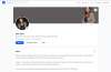
You paid for a professional headshot. It looked incredible on your photographer's screen. Then you uploaded it to LinkedIn & something died in the process.

The grays went muddy. The blacks crushed. That clean, seamless gradient behind you? Now a blocky mess of compression artifacts. Your crisp, confident portrait now looks like it was saved off an old Nokia and screenshotted twice for good measure.

It's not the photo's fault. It's LinkedIn's aggressive image compression algorithm — and it has no mercy for gradients, subtle tonal transitions, or finely detailed backgrounds.

The good news? Once you understand why this happens, you can work around it entirely. Here's exactly how.

Why LinkedIn Compresses Your Profile Image So Aggressively

LinkedIn scales and recompresses your profile photo the moment you upload it. The platform targets a very small file size to serve images quickly across millions of profiles, across devices, and across slow mobile connections. The result is a JPEG compression pass that strips out subtle tonal information — particularly in shadows and dark mid-tones.

Gradients are especially vulnerable. A smooth gradient is, at the pixel level, a huge amount of unique colour data. JPEG compression approximates this data in "blocks," and when those blocks get aggressive enough, you see the tell-tale stair-stepping effect — what photographers call banding or compression artifacts.

The Core Problem
LinkedIn's compression drastically reduces the dynamic range of your image — i.e. the subtle difference between a deep charcoal and a true black, or between a warm mid-grey and a cool one. These tonal nuances are what make a professional photograph feel three-dimensional and alive.
When they're lost, the image looks flat, murky, and amateurish — regardless of how well it was shot.

What to Avoid When Shooting (or Choosing) Your Profile Photo

Before you even think about export settings, the image itself needs to give compression as little to destroy as possible.

  • Avoid strong gradient backgrounds. Seamless paper washes that travel from dark to light, and heavy vignettes, are compression's favourite targets. They look stunning in print or on a high-resolution screen and fall apart on LinkedIn. (A very subtle, gentle gradient can survive — it's the large luminance shifts that band badly.)
  • Go for solid, flat background colours. A clean white, a neutral mid-grey, or a solid dark tone compresses far better because there's almost no tonal variation for the algorithm to destroy. What you see is what you get.
  • Keep the background simple if you're shooting against a wall or natural environment. Busy textures behind you can also introduce noise that worsens under compression.

NOTE: A solid background is not a compromise — it is a deliberate choice that communicates confidence, clarity, and professionalism. The world's most iconic corporate headshots use solid or near-solid tones. There is a reason for that.

Workflow to Optimise Your LinkedIn Profile Image for Upload

Your goal is to hand LinkedIn a file that's already so small and compressed that the platform's own algorithm has very little left to destroy. This is counter-intuitive — you're intentionally reducing quality before upload — but the result is a sharper, more consistent final image than if you'd uploaded a high-resolution file and let LinkedIn do the work.

  1. Figure Out Your Crop First: Before touching export settings, decide exactly how your photo will be framed as a circular profile thumbnail. LinkedIn crops to a circle, so make sure your face is centred, your eyes land in the upper third, and there's breathing room around your head. Do this in your editing or export software — not in LinkedIn's built-in crop tool.
  2. Export at ~600 pixels: You don't need a large file — LinkedIn will resize it anyway. Exporting at 600–800 pixels gives the algorithm far less pixel data to mangle. Anything larger is just handing the compression engine more information to approximate poorly.
  3. Lower Quality Until You Get a File Under 50 KB: This is the part most people get wrong. Using a tool that gives you granular control over JPEG quality — GIMP, Photoshop's legacy "Save for Web" tool, or Affinity Photo — reduce compression quality incrementally. Your target is a file under 50 KB. Tweak both the resolution and the compression quality slider until you land there. A well-shot photo on a solid background handles this beautifully.
  4. Upload Directly, Skip LinkedIn's Adjustments: Once you've cropped and exported, upload the final file and leave LinkedIn's positioning tool alone as much as possible. Zooming or repositioning inside their interface means your image gets resampled again before saving. Your image is already cropped correctly — confirm and move on.

PRO TIP: Before uploading, zoom your exported file out to roughly thumbnail size — about the size of your thumbnail on the screen — and squint. That's how most people will actually encounter your photo: 48 pixels wide, next to a comment in a feed. If your face doesn't read clearly at that size, recrop tighter. No export setting fixes a crop that's too loose.

Why "Export for Web" Tools Make a Difference

Most photo export workflows are built for print or high-resolution digital use — they preserve maximum data. "Export for Web" tools, by contrast, are designed to make the smallest possible file while keeping the image perceptually clean to the human eye.

Photoshop's legacy Save for Web tool (File → Export → Save for Web, or the keyboard shortcut Alt + Shift + Ctrl + S on Windows / Option + Shift + Cmd + S on Mac) gives you a live side-by-side preview of quality vs. file size. GIMP's "Export As" dialog gives you similar granular JPEG quality controls. Use the preview. Trust your eyes. Keep reducing until you hit under 50 KB — you'll likely be surprised how clean it still looks at that size, especially on a solid background.

Frequently Asked Questions

  • Does image format matter — should I use PNG instead of JPEG?
    • PNG is lossless and will be larger in file size. LinkedIn compresses it regardless during upload — and a large PNG gives the algorithm more to aggressively compress. A well-prepared JPEG under 50 KB, processed in a controlled export environment, will almost always outperform a large PNG that's been compressed by LinkedIn's servers on arrival.
  • What's the minimum safe resolution for a LinkedIn profile image?
    • LinkedIn displays profile images at sizes ranging from a tiny 48×48 px thumbnail in notifications all the way to 400×400 px on your profile. An export at 600 px gives comfortable headroom above the maximum display size while remaining small enough to minimise LinkedIn's re-compression damage.
  • I don't have Photoshop. What free tools can I use?
    • GIMP (free, open-source, Windows/Mac/Linux) has a fully functional "Export As" dialog with JPEG quality control. Squoosh (browser-based, free) is another excellent option — it gives you a real-time comparison of file size vs. quality and supports JPEG compression control. Both are more than capable of handling this workflow.
  • My photo was taken on a gradient background. What should I do?
    • A subtle, gentle gradient may survive — but a large shift in luminance (a background that travels visibly from dark to light) will band badly under LinkedIn's compression, no matter how carefully you export. Consider reshooting — or at minimum, have a professional editor replace the background with a solid tone. The photograph itself may be excellent; the background choice is simply working against it on this particular platform.

Skip the Guesswork — Get a LinkedIn-Ready File When You Book Your Headshot

When you book a corporate headshot session with us at Artriva Studios, we don't just hand you a retouched file and wish you well. Ask us during your session and we'll prepare your LinkedIn-optimised export — the right crop, the right size, the right compression — ready to upload the moment you walk out.

Your profile photo is doing a job. Let's make sure it's doing it well.

View Our Corporate Headshot Packages

Are you tired of dealing with photography studios that promise premium quality but deliver disappointing results?
Have you experienced the frustration of unprofessional service, poor print quality, or excessive pricing that doesn't match the value you receive?
You're not alone.

Many individuals and families in Bangalore have faced similar challenges with established photography chains. From awful prints to rude staff behaviour, from overpricing to poor follow-ups, the common complaints reveal a disturbing pattern: studios that prioritize volume over quality and profits over customer satisfaction. Recent customer reviews across Bangalore reveal troubling patterns at traditional photography studios:

  • Poor Quality Photography & Editing: Customers report receiving photos that look like they were edited by a child, with inconsistent colours and amateurish composition that doesn't justify professional pricing.
  • Unprofessional Staff: From rude managers who refuse to listen to complaints, to photographers who miss scheduled appointments, the lack of professionalism is shocking, especially when it comes from established chain of stores claiming decades of experience.
  • Print Quality Issues: Wrong dimensions, poor colour reproduction, and low-resolution outputs that fail to meet basic professional standards.
  • Pricing Deception: charges being high without delivering proportional quality, lack of clear communication of pricing, and hidden charges.
  • Poor Customer Service: Non-Existent After Sales Service/Support, months of delays, inability to reach decision-makers, and complete lack of accountability.
  • Lack of Transparency: No written agreements, refusal to provide invoices, unclear turnaround times etc.
Page 1 of 4

insta-img
insta-img
insta-img
insta-img
insta-img
insta-img
insta-img
insta-img
insta-img
insta-img
insta-img
insta-img
insta-img
insta-img
insta-img
insta-img
insta-img
insta-img
« July 2026 »
Mon Tue Wed Thu Fri Sat Sun
    1 2 3 4 5
6 7 8 9 10 11 12
13 14 15 16 17 18 19
20 21 22 23 24 25 26
27 28 29 30 31    
  • First time working with Studio Lights ?
  • Total cost of production hard to estimate ?
  • Do you need additional support for your shoots ?
  • Finding it hard to manage the entire production ?

We follow a no-compete policy and an assistant is provided to help you get started in the shortest possible time. Unlike our competition our studio rentals include the full set of lighting equipment & accessories listed on our website when you hire our studio.

Production houses & brands can also outsource the production which will be executed strictly as per the mood-board, the post-production can be undertaken by us/raw rata can be transferred to you during/immediately after the shoot.

Quick Links

Our fully equipped photography studio is available for hire, details of studio dimensions, facilities & equipment can be found here

Online Booking

Have a Question or need support ??
Open a support ticket and we will take care of the rest   

Support Portal

insta-img
insta-img
insta-img
insta-img
insta-img
insta-img
insta-img
insta-img
insta-img
insta-img
insta-img
insta-img
insta-img
insta-img
insta-img
insta-img
insta-img
insta-img
« July 2026 »
Mon Tue Wed Thu Fri Sat Sun
    1 2 3 4 5
6 7 8 9 10 11 12
13 14 15 16 17 18 19
20 21 22 23 24 25 26
27 28 29 30 31