



Business & Personal Branding (28)
Pricing, positioning, and the decisions that shape how you're seen — on paper and in person.
Matrimonial Photos That Feel Like You: Comfort Over Posing
Written by Artriva StudiosSomewhere, there is a person who will one day sit across a table from you. They'll watch you talk about something you love. They'll see you pause, laugh, lean in. And in that ordinary moment, they'll think: I like being here, with this person.
That moment is what a matrimonial photograph is supposed to promise.
Not a model's pose. Not a Pinterest recreation. Not the most impressive version of you — the most recognisable one. The you that the right person is going to fall for anyway.
This is how we think about matrimonial and dating profile portraits at our studio, and it changes almost everything about how the shoot is done.
How Professional Photography Quietly Improves Your SEO
Written by Artriva StudiosAsk a founder how their marketing is going, and you'll usually hear about likes, reach, and follower counts. Ask them how long a visitor stays on their website — and you'll usually get silence.
That silence is expensive. Because somewhere between chasing the feed and neglecting the website, most businesses have the equation backwards: the metric they obsess over rewards being loud for a second, while the metric they ignore rewards being worth someone's time — and it's the second one that search engines, credibility, and eventually sales are built on.
This post makes a case that sounds strange at first and obvious by the end: professional photography is one of the most underrated SEO investments a business can make. Not because Google counts megapixels — it doesn't — but because of a chain of very real, now well-documented mechanisms that runs from the quality of what's on your pages, through how long people stay on them, to where you rank. We'll walk the whole chain, with the evidence.
Why LinkedIn Is Quietly Ruining Your Profile Photo & How to Fix It
Written by Artriva Studios
You paid for a professional headshot. It looked incredible on your photographer's screen. Then you uploaded it to LinkedIn & something died in the process.
The grays went muddy. The blacks crushed. That clean, seamless gradient behind you? Now a blocky mess of compression artifacts. Your crisp, confident portrait now looks like it was saved off an old Nokia and screenshotted twice for good measure.
It's not the photo's fault. It's LinkedIn's aggressive image compression algorithm — and it has no mercy for gradients, subtle tonal transitions, or finely detailed backgrounds.
The good news? Once you understand why this happens, you can work around it entirely. Here's exactly how.
Why Bangalore's Discerning Professionals Choose Artriva Studios Over Traditional Photography Services
Written by Artriva StudiosAre you tired of dealing with photography studios that promise premium quality but deliver disappointing results?
Have you experienced the frustration of unprofessional service, poor print quality, or excessive pricing that doesn't match the value you receive? You're not alone.
Many individuals and families in Bangalore have faced similar challenges with established photography chains. From awful prints to rude staff behaviour, from overpricing to poor follow-ups, the common complaints reveal a disturbing pattern: studios that prioritize volume over quality and profits over customer satisfaction. Recent customer reviews across Bangalore reveal troubling patterns at traditional photography studios:
- Poor Quality Photography & Editing: Customers report receiving photos that look like they were edited by a child, with inconsistent colours and amateurish composition that doesn't justify professional pricing.
- Unprofessional Staff: From rude managers who refuse to listen to complaints, to photographers who miss scheduled appointments, the lack of professionalism is shocking, especially when it comes from established chain of stores claiming decades of experience.
- Print Quality Issues: Wrong dimensions, poor colour reproduction, and low-resolution outputs that fail to meet basic professional standards.
- Pricing Deception: charges being high without delivering proportional quality, lack of clear communication of pricing, and hidden charges.
- Poor Customer Service: Non-Existent After Sales Service/Support, months of delays, inability to reach decision-makers, and complete lack of accountability.
- Lack of Transparency: No written agreements, refusal to provide invoices, unclear turnaround times etc.
Showcasing the People Behind: Corporate Headshots & Lifestyle Photography for Startups
Written by Poojitha DondapatiWhen someone looks at a start-up for the first time—an investor, a potential hire, or a future partner—they don't start by analysing the product. They look at the people behind it.
Before a meeting is booked or a conversation begins, impressions are already forming through photographs—on websites, pitch decks, LinkedIn pages, and hiring portals.
Whether you're a small founding team preparing for angel conversations, or a growing start-up expanding after venture funding, the way your team appears visually sets expectations long before you speak.
Corporate Dressing Levels for Indian Women | Power to Casual
Written by Artriva Studios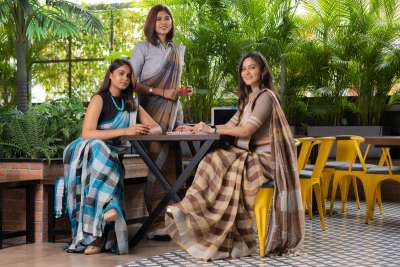
Before you ever say a word, your clothes have already spoken. In the workplace, your outfit shapes how people perceive your confidence, credibility, and leadership — and whether you realise it or not, it's doing a good part of your personal branding for you, before you've opened your mouth.
As a photographer and personal branding specialist, I see this play out constantly, on both sides of the camera:
- The right outfit can elevate a headshot, a presentation, or a client meeting — it doesn't just look good, it changes how the room responds to you.
- The wrong one can make you look unsure, unprepared, or less capable than you actually are — even when your work is excellent.
Good news? You don't need a giant wardrobe. You need clarity on what to wear at what level of formality, and why it works — because once you understand the "why," you stop guessing and start dressing on purpose.
Let's decode the 4 corporate dressing levels for Indian women, with Indian and Western options, the reasoning behind each recommendation, colour and footwear guidance, and where each style actually fits.
How to Use This Guide
Before the breakdown, a quicker way to find your level than reading all four: ask yourself three questions before you get dressed for a work day.
- Who's in the room? Senior leadership and clients pull you toward Formals. Your own team pulls you toward Casuals.
- What decision is being made? If money, hiring, or strategy is being decided in that meeting, dress a notch more formal than the room requires. If it's a working session or a brainstorm, a notch more relaxed builds better rapport.
- Will this be photographed? Headshots, keynote stills, and press photos deserve Level 1 or 2 — even if the actual day would otherwise be casual. Photographs outlive the meeting.
Keep this in mind as you read — the four levels below aren't strict boxes. Most working women live across two or three of them in the same week, sometimes the same day.
Corporate Dressing Levels in India
| Level | Style | When to Wear |
|---|---|---|
| 1 | Business Formals | C-Suite, Leadership, Client Pitches, Board Meetings |
| 2 | Business Casuals | Mid-Level Roles, Presentations, Internal Meetings |
| 3 | Smart Casuals | Creative Roles, Client Lunches, Casual Fridays |
| 4 | Work-Appropriate Casuals | Startups, WFH, Relaxed Offices |
Think of these less as four separate wardrobes and more as one sliding scale — the same well-chosen blazer can move you from Level 2 to Level 1 in the time it takes to put it on.
Level 1: Business Formals (Power Dressing / C-Suite)
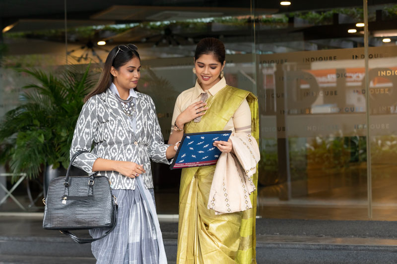
Purpose: Builds authority, creates impact and trust. Personal Branding Angle: This is your "leadership uniform." Use it to signal: I'm in control. I make decisions. You can rely on me.
Why This Works
Structure is doing most of the work at this level. A tailored blazer squares off the shoulder line, and a squared shoulder line reads — almost universally, across cultures — as authority. It's the same visual logic a military uniform or a judge's robe uses, just softened for an office. Solid colours and minimal patterns matter for a related reason: patterns pull the eye around a room, but solid, well-fitted fabric holds attention on your face, which is where you actually want it during a negotiation or a pitch. This is also why photographers ask clients to avoid busy prints for headshots — the same rule that flatters a portrait flatters a boardroom.
Indian Wear Options
- Solid silk or crisp cotton sarees (minimal borders)
- Structured sarees with tailored blouses
- Well-fitted kurtis with straight trousers + blazer
- Long jackets or Nehru jackets over kurta sets
Western Wear Options
- Tailored pantsuits (matching blazer + trousers)
- Formal sheath or pencil dresses (knee-length or below)
- Crisp button-down shirt + tailored trousers + blazer
- Blazer over solid blouse + trousers
Recommended Colours
- Navy, Charcoal, Black, Ivory
- Deep jewel tones: Emerald, Burgundy, Royal Blue
These colours share one trait: high contrast and low distraction. They photograph cleanly under office lighting and camera flash alike, which is part of why they've become the unofficial uniform of leadership everywhere, not just in India.
Footwear
- Closed-toe heels or block heels
- Polished flats (if heels aren't comfortable)
Closed-toe footwear finishes the "put-together" signal that a blazer starts — open-toe sandals, however elegant, read as slightly more relaxed, which undercuts the authority you're building everywhere else in the outfit.
Where & For Whom?
- CXOs, VPs, Senior Managers
- Client negotiations, boardrooms
- Media appearances, keynote speeches
- Professional headshots for leadership roles

Level 2: Business Casuals
Purpose: Being professional and approachable. Personal Branding Angle: Confidence without intimidation — the perfect balance of authority and warmth.
Why This Works
This level trades some of Level 1's structure for softer fabrics and slightly more colour, and that trade is deliberate. A blazer says "authority." A cardigan or light jacket over a kurti says "authority, but approachable" — the silhouette is still tidy, but the fabric moves and drapes rather than holding a rigid line. This is the level where colour starts doing more work than cut: earthy pastels and muted tones read as warm and easy to talk to, without slipping into the visual softness that reads as too casual for a client-facing role.
Indian Wear Options
- Linen or soft printed sarees (elegant, not flashy)
- A-line or straight kurtis + cigarette pants
- Kurtis with light blazers or jackets
- Solid kurta sets in luxurious fabrics
Western Wear Options
- Solid or subtle print shirts + ankle-length trousers
- Blouses + structured pants
- Midi or sheath dresses (with sleeves or blazer)
- Knitted tops with light layers
Suggested Colours
- Soft blues, maroon, wine
- Earthy pastels (beige, olive, dusty rose)
- Teal, muted mustard
Footwear
- Mules, loafers, block heels, ballet flats
Notice the shift from Level 1: closed-toe is no longer the only acceptable option. Mules and loafers keep the polish while adding just enough ease to match the rest of the outfit.
Where & For Whom?
- Mid-level managers, team leads
- Internal presentations, training sessions
- Everyday office wear in formal environments
Level 3: Smart Casuals
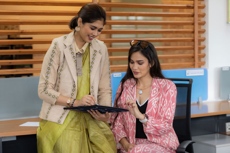
Purpose: Stylish, modern, relaxed — but still very polished. Personal Branding Angle: This style shows creativity and adaptability. Great for modern workplaces and roles that require fresh ideas.
Why This Works
This is the one level where breaking a rule is the point. Asymmetry, colour-blocking, and fusion pairings (a cotton saree with a structured blouse, or a kurta over jeans) signal that you think outside conventional lines — which is exactly the impression a designer, marketer, or creative lead wants to give. The polish still has to be intentional, though: a slim-fit dark wash jean reads as "considered," a faded, ill-fitting one reads as "didn't think about it." Smart casual is casual with effort still visible, not casual because effort stopped.
Indian Wear Options
- Printed / asymmetrical kurtas + jeans
- Indo-western fusion sets
- Cotton sarees with trendy blouses
- Long shrug or jacket over kurti/tee
Western Wear Options
- Tops + culottes/chinos
- Slim-fit jeans (dark wash) + blouse/shirt
- Layered pieces (shrugs, cardigans, long jackets)
- Patterned shirts, peplum tops
Colours
- Pastels, warm hues, colour-blocking
- Stylish prints (stripes, geometrics, florals)
Footwear
- Stylish sandals, wedges, loafers
Where & For Whom?
- Creative teams, marketing, design, tech
- Client lunches, informal meetings
- Casual Fridays in corporate settings
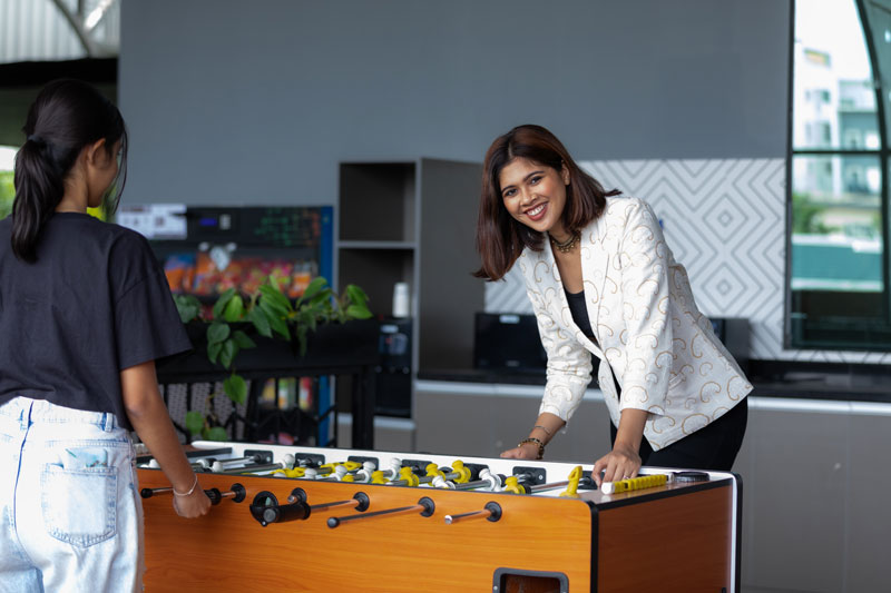
Level 4: Work-Appropriate Casuals (Startups / Remote Work / Relaxed Dress Codes)
Purpose: Comfort-first, but still emphasising neatness and being presentable. Personal Branding Angle: Even in relaxed settings or on Zoom calls, how you show up visually still builds or breaks trust and credibility.
Why This Works
The instinct at this level is to stop trying — resist it. "Work-appropriate casual" still means clean lines, no visible wear, and fabric that holds its shape on camera. A soft T-shirt and jeggings can look just as put-together as a blazer if the fit is right and the fabric isn't stretched or faded; the bar hasn't disappeared, it's just moved. This matters more than people expect on video calls specifically — a webcam compresses colour and detail, so a slightly wrinkled top or a washed-out colour reads worse on Zoom than it would in person.
Indian Wear Options
- Cotton kurtis + leggings or palazzos
- Co-ord kurta sets
- Relaxed-fit kurtas
Western Wear Options
- Smart T-shirts (solid or minimal prints)
- Soft blouses or relaxed shirts
- Stretchable trousers, jeggings, or dark jeans
- Casual dresses (knee-length, minimal prints)
Colours
- Soft neutrals (beige, blush, grey)
- Muted pastels
- Pop of colour through accessories
Footwear
- Clean sneakers
- Comfortable flats
- Slip-ons
Where & For Whom?
- Startups, remote work, WFH
- Brainstorming sessions, creative roles
- Casual company cultures (tech, media, agencies)
What Happens When You Get the Level Wrong
Both directions cost you something, just in different currencies. Show up overdressed to a casual team brainstorm in a full Level 1 suit, and you can accidentally signal distance — like you're not quite one of the team, or you're dressed for a meeting that isn't this one. Show up underdressed to a board presentation in Level 4 casuals, and the room's attention drifts, even briefly, from your content to your appearance — exactly the opposite of what you want when you're the one presenting the numbers.
The safer error, when genuinely unsure, is to go one level more formal than you think you need. Removing a blazer takes five seconds. Nobody in a boardroom has ever conjured one from nowhere.
BONUS TIPS: Comfort Dressing
Comfort doesn't mean careless. Here's how to stay relaxed and still look professional — and why each of these actually works, not just that it does.
- Choose breathable fabrics: cotton, linen, modal, crepe — these move with you and don't visibly wrinkle at the first sign of AC-to-outdoor temperature swings, which matters more in Bangalore's weather than almost anywhere else.
- Stretchable waistbands or trousers — comfort you don't have to think about during a long client meeting is comfort that shows up as ease in your body language, and that ease reads as confidence on camera.
- Low-maintenance sarees (linen, georgette, blends) — drape and hold their shape through a full workday without needing a mid-afternoon fix.
- Flowy tops with structure at the neckline or sleeves — the structure is what keeps "relaxed" from tipping into "unfinished."
- Layering for AC/temperature control — a thin jacket or shrug is a silent tool for moving between Level 2 and Level 1 without a wardrobe change.
- Cushioned flats or block heels over pointy stilettos — visible discomfort (shifting weight, wincing) undercuts authority faster than almost anything else in a room.
Understanding Basic Colour Psychology in Personal Branding
Colour reads before anyone processes what you're wearing — it's the first thing the eye registers, often before cut or fabric. Some of this is genuinely psychological (darker, saturated colours are consistently read as more "serious" across studies on colour and perception), and some is cultural — navy-and-white as a business uniform, for instance, is a learned association from decades of corporate dress codes, not an innate one. Both matter for how you're read in a room.
| Colour | Message | Why It Reads This Way |
|---|---|---|
| Navy / Black | Power, leadership, trust | High contrast, low visual noise — decades of corporate association reinforce it further |
| White / Grey | Clarity, professionalism | Neutral base colours put visual focus on your face and words, not the outfit |
| Blue | Dependability | Consistently rated the most "trustworthy" colour across colour-perception research |
| Burgundy / Deep Red | Authority with elegance | Red-family tones signal energy and confidence; the deep, muted shade keeps it boardroom-appropriate |
| Pastels | Approachability, softness | Lower colour saturation reads as gentler and less confrontational |
| Teal / Mustard / Wine | Creativity, uniqueness | Less common in standard corporate wardrobes, so they stand out as intentional choices |
Tip: Build a signature colour palette for yourself — two or three colours you return to often. Repetition is what makes a personal brand memorable; people remember "the woman who always wears deep teal" far more easily than someone whose colours change every week.
Accessorising & Grooming — Small Details, Big Impact
- Minimal jewellery = elegant and distraction-free. The same principle from Level 1 dressing applies here: less visual noise keeps attention on your face and your words.
- A structured handbag = instant professionalism. Structure signals intention the same way a tailored blazer does — a soft, slouchy bag can undercut an otherwise sharp outfit.
- Groomed hair = roughly half of overall polish. It's the single fastest thing a room — or a camera — registers about how "put together" you are.
- Nails, watch, light makeup = the finishing touches that signal attention to detail, which people unconsciously extend to assumptions about your work quality too.
These details matter in photographs, but they matter just as much on video calls — a webcam is an unflattering, low-resolution judge of grooming, so what barely registers in person can read as noticeably unkempt on Zoom.
Build a Versatile Wardrobe (Mix the Levels)
You don't need fifty outfits — you need pieces that move easily between two or three levels. This is also the most cost-effective way to dress well: a blazer that works across Levels 1 and 2 earns its price back in a way that ten single-occasion outfits never will.
Worth investing in:
- 2 well-fitted trousers (black + beige/navy)
- 1–2 blazers (neutral + a signature colour)
- Neutral skirts or culottes
- High-quality kurtis (solid + printed)
- A power saree and an easy-care saree
- Comfortable yet stylish footwear
- Good innerwear — absolutely essential, and the most overlooked item on this list
Note: Keep 1–2 "Power Outfits" ready to go, pressed and hanging, for the days that don't give you advance warning. The best client-pitch outfit is the one that's already clean and ironed when the meeting gets moved up to tomorrow morning.
Final Thoughts: Dressing Is Not Vanity — It's Strategy
Every outfit is a message. Every colour, cut, fabric, and accessory contributes to your personal brand, whether you're choosing deliberately or on autopilot.
You don't have to follow fashion trends. You just need to dress with intention — understanding not just what to wear, but why it works, so you can adapt the principle to any situation instead of memorising four fixed outfits.
Wear what expresses your competence, confidence, and individuality — at the right level, in the right place.
Because when your outfit works for you…
You walk differently. You speak differently. You own the room.
Corporate lifestyle photography – what it is, why it matters, and how to plan a professional shoot that elevates your brand and workplace culture.
Written by Artriva Studios
“Corporate lifestyle photography is all about capturing real, unscripted moments that showcase your brand’s personality — and, more importantly, the people who bring it to life.”
But let’s dig deeper: corporate lifestyle photography does more than freeze a moment. It captures professionals in real, purposeful work environments — showing not just their faces, but the culture, energy, and brand personality behind them. It humanises your company, giving viewers a window into everyday work life. This human touch matters because different viewer segments see your brand through different lenses: clients look for credibility, employees look for belonging, potential hires look for aspiration, investors look for trust, and the general public forms an overall impression of who you are.
Why It Matters
In today’s world of visual communication, corporate lifestyle photography is no longer optional — it’s essential. The right imagery helps you:
- Build a consistent and authentic brand library for your social media.
- Create a cohesive visual language across your website, LinkedIn, and other online platforms.
- Enhance recruitment campaigns by showcasing your culture and workplace.
- Build a personal connect in client proposals and presentations.
- Strengthen public relations through real, relatable visuals.
When executed well, corporate lifestyle photography becomes a powerful tool in shaping how your brand is seen — internally and externally.
- How to plan for a Corporate Lifestyle shoot
- Corporate Lifestyle
- Corporate Imagery
- corporate photography Bangalore
- office photoshoot
- company culture
- corporate team photography
- corporate image building
- branding photography services
- corporate communications visuals
- corporate PR photography
- authentic corporate imagery
- corporate headshots photography
- Affordable corporate headshot packages
- professional corporate headshot photographers
Valentine's Day Special: Capture Your Love Story at Artriva Studios
Written by Artriva Studios
As Valentine's Day approaches, love is in the air, and what better way to celebrate than capturing your unique love story with a Couple's Photography Session at Artriva Studios?
Whether it's your first Valentine's together or your fiftieth, we are here to immortalize your moments with your loved one in a way that reflects your unique bond.
Fraud Alert : (Featured on - Amazon/Flipcart/Hopscotch/IKFW(India Kids Fashion Week)/Myntra) Casting for Children
Written by Artriva StudiosPLEASE NOTE:
As a Rental space provider there are few things that we can enforce such as Issuing GST Invoices (for both record keeping & having money trail as to who made the booking & was paid by whom etc), Clients are only comfortable with providing generic information such as E-Commerce shoot, Jewellery, Fashion/Portfolio etc before making a booking. This creates a scenario where we are unable to fully verify a client up until we have given a confirmed booking. When in doubt we do ask ask for an e-mail listing the scope of work / promises to end client etc.
Over the last year(s), we have come across several parents having fallen for a paid activity where their kids are featured on the sites of some of the "brand names" mentioned in the title. Our (and many other studios of photographers in Bangalore) are mentioned as the venue for these activities.
Intention of this article is to avoid Brand Names / Trademarks from being misused -
Now coming to the topic of "Sham Portfolio Shoots for Kids", wherein many dubious entities have been collecting various sums of monies from gullible parents in the name of "Featuring their children on popular E-Commerce Sites (& other opportunities)".
The Importance of a Good Corporate Headshot
Written by Artriva Studios
Every successful professional has optimised a way to make clients comfortable with their business or organisation in seconds. It’s those important first impressions — in this new age of LinkedIn, company websites, and virtual meetings on Zoom, Skype, or Teams — that can make or break what might have been a long, mutually beneficial business engagement.
The first human vibe communicated when a prospective client sees a sales executive, service professional, or even a business owner can either put them at ease or make them cautious.
Research on first impressions shows that facial expressions and micro-emotions play a crucial role in how we judge trustworthiness and competence — often within milliseconds. (Reference: Cognitive Emotion Study, 2012)
That’s precisely why, during our corporate headshot sessions in Bengaluru, we place special emphasis on guiding expression, posture, and intent — to bring out the real you at your most confident and approachable.
- Best Corporate Headshots in Bangalore
- Headshots in Bangalore
- Corporate Headshots
- Corporate Portraits
- Business Portraits
- International Quality Portraits
- International quality Headshots
- What makes a good corporate headshot stand out
- Affordable corporate headshot packages
- find professional corporate headshot photographers
More...
Understanding Pricing Photography Services
Written by Sukla Chinnappa
"Pricing Photography Services" is a topic little understood by my many new age freelance & even some professional photographers. A consequence of poor financial planning has its effects on deliverables to clients, a reason for non-photographers (Clients) to read this article too.
Photography looks easy, Lots of cameras are available, even phones have over 100MP resolutions these days.
- Then why a photographer?
- Premium pricing for photography?
- Do I lose out on anything when I hire a photographer who charges less?
Quick guide for getting noticed on Matrimonial Websites & Dating Apps
Written by Sukla Chinnappa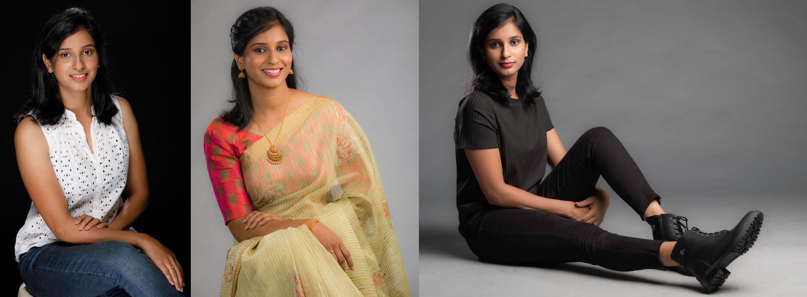
If there is that one major factor that guarantees your chance of getting noticed online matrimony profile, it is your profile photograph, a well-shot headshot. Your headshot is your first impression and the deciding factor for you to get noticed or ignored. Once a first impression is made, it is very hard to change that perception of you. A good set of profile pictures communicates a lot about your personality and your seriousness in a relationship.
Psychologists say it takes about a tenth of a second to form an impression about the person we meet!
No wonder First Impression is the Best Impression
Most people are put off by poor quality photos that are
- low in resolution
- grainy/noisy and taken in dull light.
- having very old photographs in your profile.
- not having enough variations in your pictures used in your profile
- photos that don’t really represent who you are (your intro text says something which does not match your picture portfolio)
Read on to know more on how to go about creating an online profile that gets you the most responses from people you are most compatible with.
We have been receiving regular enquiries for "Photo Print & Framing", and we have been unable to service these requests with almost all commercial printers out of operation most people are reaching dead-ends. Desperation is such that I have now given away the frames that I had to use as photography props for my photoshoots.
This post is an announcement of limited printing services at our Studio & a collection of links to some printers that are operational.
NOTE: Printing is NOT OUR CORE BUSINESS, and our printing capability/capacity has just been to validate our workflow for colour matching. This post will be continuously updated with more links (if traffic is more) and updates if any to our printing Capacities.
Quality E-Commerce Photography at Affordable Prices
Written by Sukla Chinnappa
With the dominance of major e-commerce platforms such as Amazon, Flipkart and the ease at which brands can go online with their own website and start selling online there is serious competition for brick & mortar stores in terms of scalability os sales by reaching out to a larger base of potential customers.
The biggest challenge that is seen in this route of building a Brand / Sales through the online route is the "Cost". Many expect e-commerce to work magic but the truth of the matter is "E-commerce does have its costs which match up to/be higher than the cost of a physical store". while the previous statement is true what one needs to realise that at the same price it also allows one to reach out to a larger client base which in turn can be converted to a higher sales volume & better margins.